
A buyer walks in, glances around for less than a minute, and has already decided whether the home feels easy to live in. That is why neutral styling for home viewings matters so much. It is not about making a property bland. It is about removing visual friction so the space, light and layout do the selling.
For agents and homeowners, this is one of the simplest ways to improve how a listing performs both online and in person. A well-styled neutral home tends to photograph better, feels calmer during viewings, and gives buyers or tenants fewer reasons to hesitate. In a market where attention is short and comparison is constant, that clarity can make a real difference.
Why neutral styling works during viewings
Most viewers are not evaluating a home like a designer. They are scanning for signals. Does the space feel clean? Does it feel maintained? Can they picture their own furniture, routine and family life here? Strong personal taste, heavy colours or awkward furniture choices can interrupt that process.
Neutral styling gives people room to project themselves into the property. Soft tones, simple furniture shapes and balanced layouts help viewers notice the proportions of a room rather than the personality of the current occupant. That is especially useful in vacant units, where empty rooms often feel smaller and more uncertain than they are.
There is also a practical side. Neutral interiors are more forgiving across different lighting conditions, which matters for both listing photos and daytime or evening viewings. They tend to make spaces look brighter and cleaner, and they reduce the risk of one room feeling disconnected from another.
That does not mean every property should look identical. A family flat, a city-fringe flat and a rental unit aimed at corporate tenants may all need a slightly different finish. The principle stays the same – keep the look broad enough to appeal to more than one type of viewer.
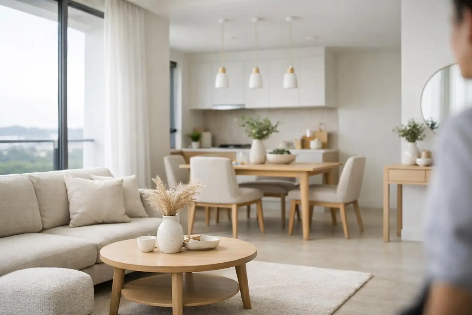
What neutral styling for home viewings actually looks like
Neutral styling is often misunderstood as using only beige and white. In practice, it is more considered than that. The goal is to create a clean, market-ready environment with enough warmth to feel liveable.
A neutral scheme usually starts with a restrained palette. Think warm whites, taupe, soft greys, muted wood tones and low-contrast textiles. These colours help a room feel settled without becoming flat. If everything is too pale and too sparse, a home can feel temporary rather than inviting.
Furniture selection matters just as much as colour. Pieces should suit the scale of the room and make its function obvious. A compact dining set can define an open-plan area. A properly sized sofa can show that a living room is genuinely usable rather than just technically large enough. In bedrooms, proportion is everything. If the bed is too small, the room feels underwhelming. Too large, and movement feels restricted.
Accessories should support the scene, not compete with it. A rug, a few cushions, simple wall art and modest greenery are often enough. The point is to create balance and softness without filling every corner.
The difference between neutral and lifeless
This is where many viewings fall short. Owners hear the word neutral and strip the property back so far that it loses comfort. Buyers do not respond well to spaces that feel cold, unfinished or managed purely for compliance.
A neutral room still needs texture and rhythm. Curtains can soften hard lines. Layered bedding can make a bedroom feel move-in ready. A lamp in the right position can make an otherwise forgotten corner feel intentional. These details are small, but they shape how long someone lingers in a room and how positively they remember it afterwards.
It also helps to avoid over-correcting. If a property already has good flooring, attractive natural light or a strong built-in feature, neutral styling should support that rather than flatten it. The best results come from editing distractions, not erasing character altogether.
Where to focus first before a viewing
Not every room needs the same level of attention. In most homes, the living area, main bedroom and dining space do the heaviest work during a viewing. These are the rooms that help people judge lifestyle, comfort and overall value.
The entry matters as well. If the first impression feels cramped, dark or neglected, viewers carry that feeling into the rest of the home. Sometimes the fix is simple – clearer surfaces, better furniture placement, and less visual clutter near the door.
Kitchens and bathrooms usually benefit less from decorative styling and more from cleanliness, order and light. Neutral presentation here means clear counters, fresh towels, tidy cabinetry lines and no unnecessary personal items. These spaces need to feel easy to maintain.
If the property is vacant, the priority is slightly different. Empty homes often make scale harder to read, especially in compact flats. Strategic furniture placement solves that quickly by showing function, circulation and proportion. It answers silent questions before they turn into objections.
Common mistakes that weaken buyer response
One of the most frequent problems is styling for personal taste instead of market response. Bold artwork, highly specific décor themes and oversized statement furniture may suit daily living, but they can narrow appeal during a sale or rental campaign.
Another issue is inconsistency. A nicely styled living room followed by a bare bedroom and an overcrowded study creates uncertainty. Viewers may not say it directly, but uneven presentation makes a property feel less resolved.
There is also the matter of furniture that does not fit the room. This happens often in occupied homes where owners are using what they already have. A bulky sofa, too many side tables, or a dining set pushed awkwardly against a wall can make the space feel smaller than it is. Neutral styling is not only visual. It is spatial.
Finally, some properties are left too empty in the name of simplicity. Minimalism can work, but only if the home still feels complete. Most viewers respond better when they can understand how each room supports everyday living.
Neutral styling for home viewings in practical terms
For agents working on tight timelines, the value of neutral styling is that it gives structure to preparation. Rather than debating personal design choices, the focus shifts to what improves enquiry, viewing flow and perceived value.
This is especially useful when a property needs to be market-ready quickly. Furniture rental and home staging allow a space to be furnished with purpose without the cost or delay of buying items outright. That flexibility matters for vacant units, short marketing windows, and situations where the owner does not want long-term commitment.
In Singapore, this approach is often the most efficient solution for sale listings, rental units between tenants, and homes being prepared for relocation-driven viewings. The goal is not decorative perfection. It is to present a complete, believable home that helps viewers make a decision faster.
That is why styling should always be tied to the likely audience. A property aimed at investors may need a clean, straightforward setup that emphasises maintenance and layout. A home targeting owner-occupiers may benefit from a warmer, more lived-in feel. Neutral styling works in both cases, but the details should reflect who is expected to walk through the door.
When professional staging makes more sense
Some homes only need editing and light preparation. Others need a full reset. If a unit is vacant, dated in appearance, or difficult to photograph well, professional staging usually delivers clearer results than trying to solve the problem room by room.
The advantage is not simply better furniture. It is having a plan for how the property should be read. Each room is styled to communicate use, scale and comfort. That makes the viewing experience smoother and reduces the mental work buyers or tenants have to do.
A practical staging partner also helps remove coordination burden. For agents and owners, that often matters as much as the visual outcome. Fast setup, reliable delivery and a coherent styling direction can turn a stressful listing preparation process into a manageable one.
Neutral styling works best when it feels effortless to the viewer. They should not be noticing design decisions one by one. They should simply feel that the home is easy to understand, pleasant to walk through and worth taking seriously.
If a property presentation is doing its job, viewers stay focused on the opportunity, not the distractions. That is usually where stronger interest begins.
Contact us now at: Kevin Chang – 80119753 sales@expatspartner.com.sg Sales Specialist