
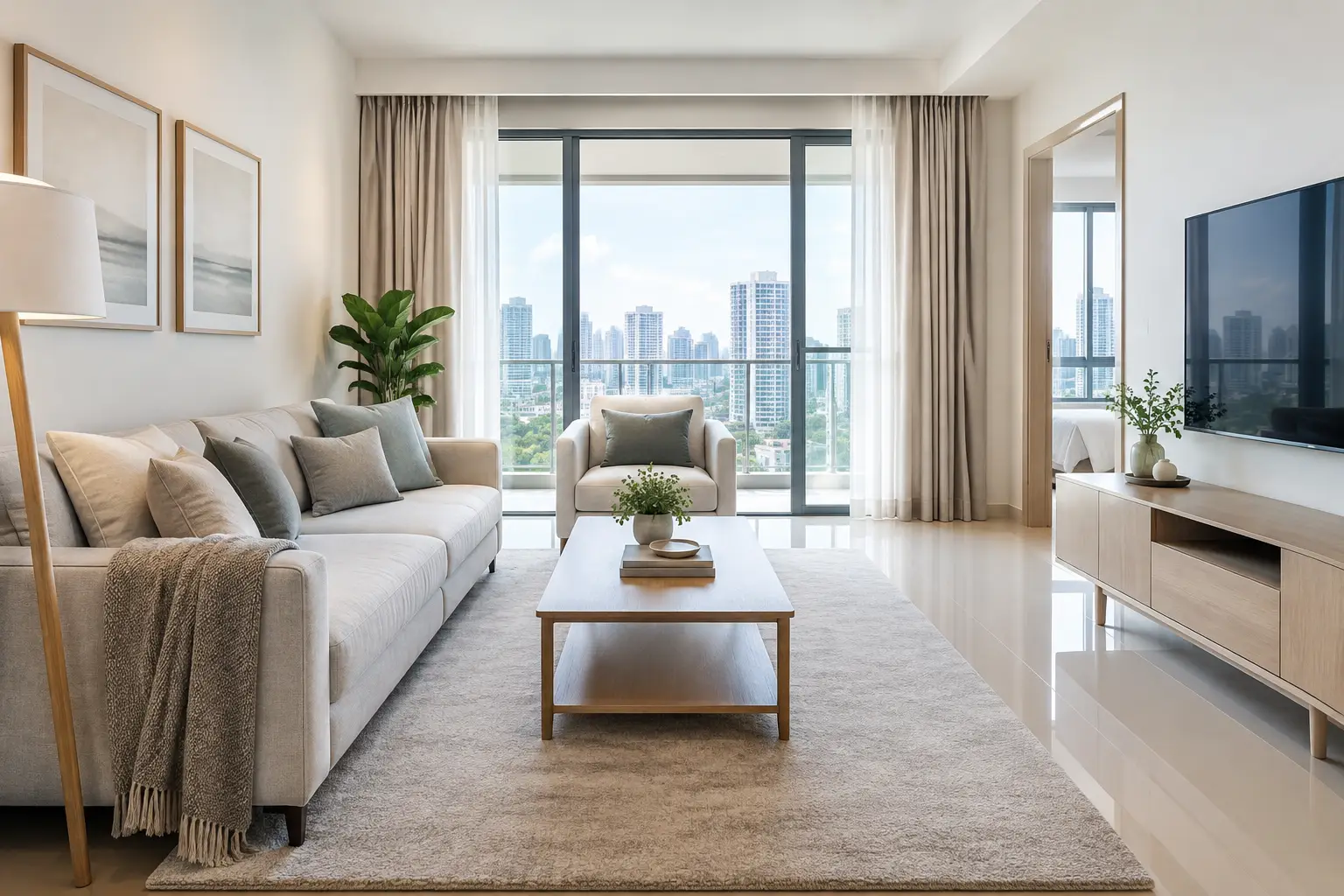
A buyer often decides how a home feels before they have reached the second room. In listing photographs and during the first few minutes of a viewing, colour influences whether a space appears bright, cared for and easy to move into. The best staging colours for sellers are not simply the safest shades on a paint chart. They are colours that work with the property’s natural light, flooring, layout and likely buyer profile, while allowing the home’s strongest features to stand out.
For sellers and property agents in Singapore, the goal is usually not to create a highly personal interior. It is to make the home feel settled, spacious and believable. A considered neutral palette, supported by warm natural tones, can help buyers picture their own furniture and routines in the space without making the property feel plain.
Why colour matters when staging a property
Colour changes how buyers read a room. Pale walls can make a compact study feel more open, while a heavy feature wall can shorten a narrow living area. A coordinated palette also gives photographs a calmer, more professional appearance, which matters when a listing is competing for attention online.
The right colours help buyers understand a room’s purpose. A soft, inviting bedroom looks more restful than one dominated by bold bedding or strong contrast. In a vacant unit, furniture, rugs and accessories can add enough warmth to stop neutral walls from feeling empty. In an owner-occupied home, editing overly bright or mismatched items can make the rooms feel more coherent without requiring a full refurbishment.
There is a practical balance to strike. Very white interiors may photograph cleanly, but can look cold under harsh lighting or against glossy tiles. Dark colours can feel refined in the right setting, yet may reduce perceived space in homes with limited daylight. Staging should respond to the particular property rather than follow one rule everywhere.
The best staging colours for sellers: a reliable base palette
For most homes, begin with soft warm neutrals. Think warm white, light greige, pale sand, oatmeal and gentle mushroom tones. These shades are flexible enough to suit contemporary condominiums, landed homes and older resale properties, while giving timber, stone and soft furnishings room to show their character.
Warm white is often the most useful starting point. It reflects light well and creates a clean backdrop, particularly in living rooms with good windows. Choose a white with a subtle cream or grey undertone rather than a stark blue-white. Under Singapore’s bright daylight, a cool white can appear clinical, while a warmer version generally feels more welcoming.
Greige, a balance of grey and beige, works well where a property has grey floor tiles, marble finishes or darker window frames. It offers more depth than white without making the room feel closed in. Pale taupe and sand perform a similar role in homes with warmer timber flooring or beige stone surfaces.
Use these colours across the larger visual areas: walls, sofas, curtains, dining chairs and larger rugs. Repeating related tones from room to room creates flow, especially in open-plan living and dining areas. The space feels organised, but not overly matched.
Add contrast through texture, not strong colour
Neutral does not have to mean flat. Layer linen cushions, timber side tables, woven baskets, ceramic lamps and textured throws in related shades. Natural materials bring depth to photographs and give buyers something reassuringly tactile during a viewing.
A charcoal cushion, black-framed artwork or dark dining pendant can provide definition in a pale room. Keep these darker accents measured. They should frame the room, not become the first thing a buyer notices.
Room-by-room colour choices that support viewings
Living room: warm, light and easy to picture
The living room carries much of the emotional weight of a viewing. A palette of warm white, beige, soft grey and light oak usually helps it feel generous and adaptable. For a property with a view, keep the colours restrained so windows remain the focal point.
One muted accent, such as olive green, dusty blue or terracotta, can add personality through cushions, a throw or artwork. These colours tend to sit comfortably with neutrals and feel current without dating the listing. Avoid large blocks of bright red, vivid purple or intense orange, which can dominate photographs and divide opinion.
Dining area: calm tones with definition
Dining spaces benefit from a simple scheme that reads clearly in photos. A light table surface, timber chairs and neutral upholstery often create a relaxed, usable setting. If the dining area is small or sits within the living room, use a rug or artwork in a complementary tone to define it without visually splitting the space.
Greenery is particularly helpful here. A modest plant or leafy arrangement introduces fresh colour and softens hard finishes without adding clutter.
Bedrooms: quiet shades that feel restful
Bedrooms should look calm, tidy and sufficiently furnished, not overly styled. Soft stone, pale blue-grey, muted sage and warm beige are reliable choices for bedding and soft furnishings. Layering white sheets with a coloured quilt or throw gives the bed dimension in listing images.
For the main bedroom, choose colours that feel adult and understated rather than heavily gendered or themed. In children’s rooms, reduce very specific décor where possible. A few playful details are fine, but a neutral bedspread and clear floor space allow buyers to see the room’s size and flexibility.
Home office or study: light enough to feel productive
A study can easily look like a storage room if the colours are too dark or the furniture is too heavy. Light timber, warm white, soft grey and a muted green accent work well here. They suggest a practical workspace without making the room feel corporate.
If the room is small, avoid a large dark desk placed directly opposite the door. A lighter desk and an upholstered chair can make it read as a useful study, guest room or flexible work-from-home space.
Kitchens and bathrooms: work with existing finishes
Sellers do not usually need to repaint kitchens or bathrooms solely for staging. Instead, select towels, accessories and small styling items that suit the fixed finishes. White or oatmeal towels work with most bathrooms, while a muted green plant can bring freshness to a vanity area.
In kitchens, clear benchtops matter more than decorative colour. A timber board, a neutral tea towel and a simple bowl of fruit may be enough. Keep bold packaging, brightly coloured cleaning products and crowded fridge magnets out of sight before photography and viewings.
Colours to use with care
Strong colour is not automatically a problem. A dark navy wall may suit a well-lit heritage home, and deep green can look convincing in a large room with high ceilings. The question is whether it supports the home’s market presentation or asks buyers to overlook it.
Use caution with very dark walls in compact flats, especially where there is little natural light. Bright primary colours, highly patterned wallpaper and themed feature walls can also make buyers focus on future repainting rather than the property itself. If repainting is not practical, balance the existing colour with lighter curtains, neutral furniture and better lighting.
The same principle applies to cool grey. It can complement modern finishes, but too much grey across walls, sofas, rugs and curtains can make a home feel chilly. Introduce timber, cream textiles and warm lighting to soften the result.
Match the palette to light, location and buyer expectations
Before choosing furniture or accessories, assess the property at the time it will be photographed. North- or east-facing rooms, shaded units and spaces with tinted windows may need warmer fabrics and lamps to counter a cooler cast. Sun-filled rooms can handle soft grey or pale blue more comfortably, provided there is enough warmth elsewhere.
Look at the fixed elements too. A home with yellow-toned marble, reddish timber or patterned tiles may not suit a fashionable all-grey scheme. Staging colours should bring existing finishes together, not compete with them. This is why a site assessment is valuable before furniture is selected.
For a vacant property, renting coordinated furniture and accessories can be a cost-conscious way to establish this palette quickly. A staging partner can plan the scale, colour balance, delivery and collection around the marketing timeline, rather than leaving the agent or seller to source individual pieces under pressure.
A practical colour check before the listing goes live
Stand at the entrance of each main room and ask what catches the eye first. Ideally, it should be the window, the sense of space, a pleasing furniture arrangement or a desirable feature such as a balcony. If it is a bright cabinet, a dark wall or a pile of competing colours, simplify the scene.
Then check the property through a phone camera. Colours that seem acceptable in person can become harsh under artificial lighting or appear dull in a photograph. Photograph during daylight where possible, turn on lamps in darker corners and keep the overall palette consistent from one image to the next.
The most effective staging colours are the ones buyers barely have to think about. When a home feels bright, balanced and comfortable, attention stays where it belongs: on the space, the lifestyle it offers and the possibility of making it their own.